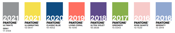
PANTONE Colour of the Year 2022
Colour can completely change the look and mood of a home. If you’re looking for inspiration for a home renovation, it’s important to consider the latest design trends – including colour. Whether you choose “trendy” colours in your home design or go in a more classic direction, consulting design experts ensures your home will look fresh.
The PANTONE Color Institute
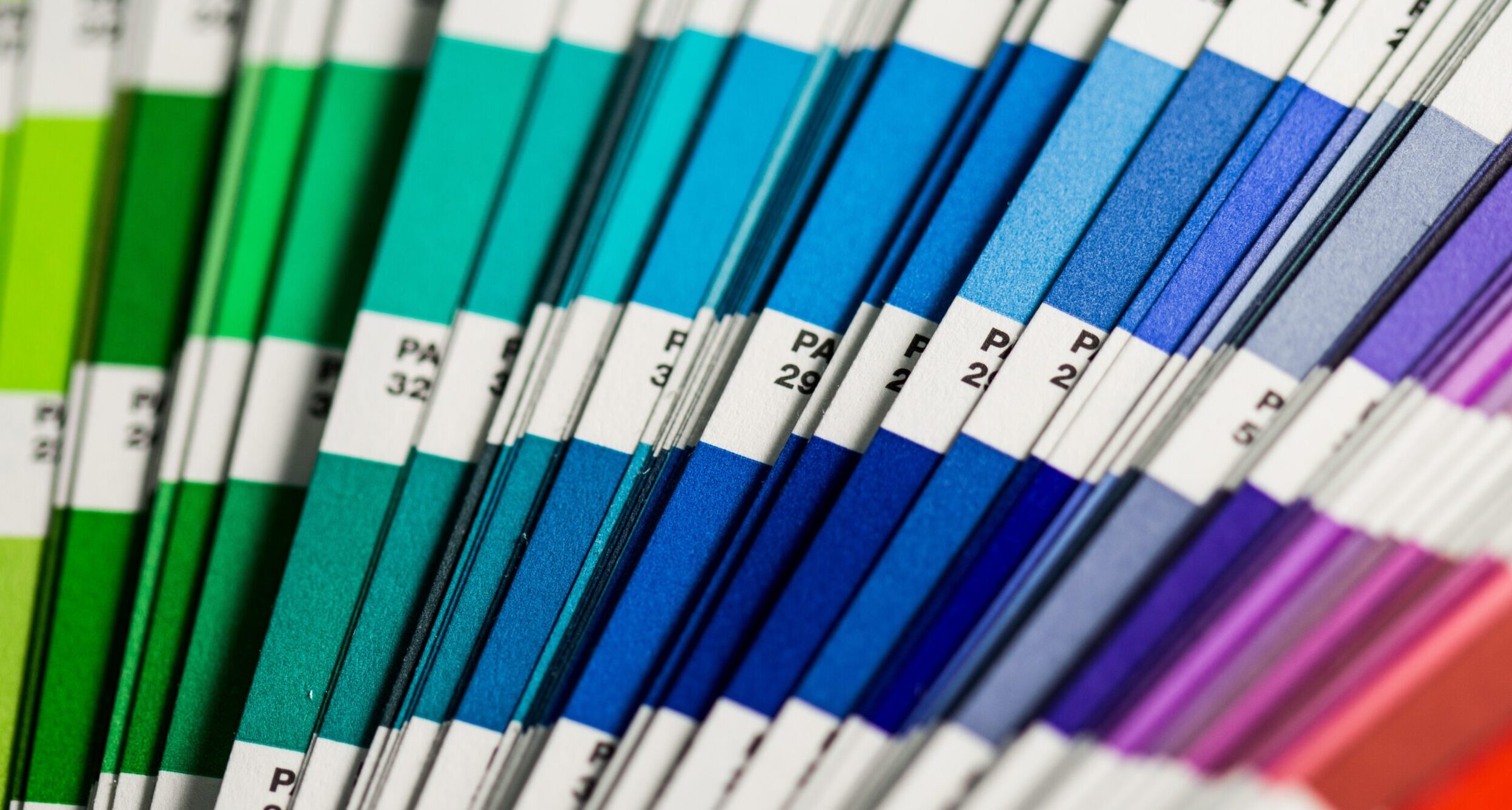
When it comes to colour, the industry agrees that the PANTONE Color Institute are the experts. For over 23 years, designers await the selection of PANTONE’s Color of the Year. This selection influences creative industries like interior design, but has a broad impact on things like product packaging.
PANTONE selects their Color of the Year after their colour experts conduct intense research. PANTONE’s experts examine the entertainment industry, view art collections and meet artists, travel, and understand evolving socio-economic conditions.
PANTONE Color of the Year 2022
Introducing the PANTONE Color of the Year 2022, PANTONE 17-3938 Very Peri.

A New PANTONE Color Whose Courageous Presence Encourages Personal Inventiveness And Creativity.
This colour draws upon existing feelings and qualities that are wrapped up in the colour blue. PANTONE 17-3938 Very Peri encourages creativity and allows us to imagine possibilities that are available to us as we “rewrite our lives”, coming out of this period of isolation. This colour features a violet-red undertone and looks forward to the future with a new, modern perspective.
PANTONE 17-3938 Very Peri is also influenced by the way our physical lives have continued to be blended with the digital. PANTONE’s description of the colour says, “Digital design helps us to stretch the limits of reality, opening the door to a dynamic virtual world where we can explore and create new color possibilities.”
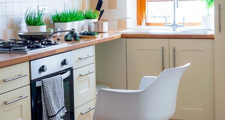
TORLYS Room Visualizer
For inspiration for how to use this colour in your home, view PANTONE’s various constructed colour palettes and see its versatility. Plus, using TORLYS Room Visualizer, try out similar paint colours on the walls of different scenes alongside TORLYS flooring. A few similar Sherwin Williams paint colours that are available in the Room Visualizer include: Awesome Violet, Dahlia, and Forget-Me-Not.

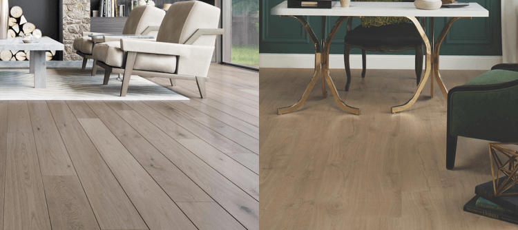
Marquee Floors by TORLYS Olympic Loose Lay Rio Walnut / Forget-Me-Not
For more interior design inspiration, explore the Interior Design Tips and Renovation Inspiration categories on TORLYS Blog.